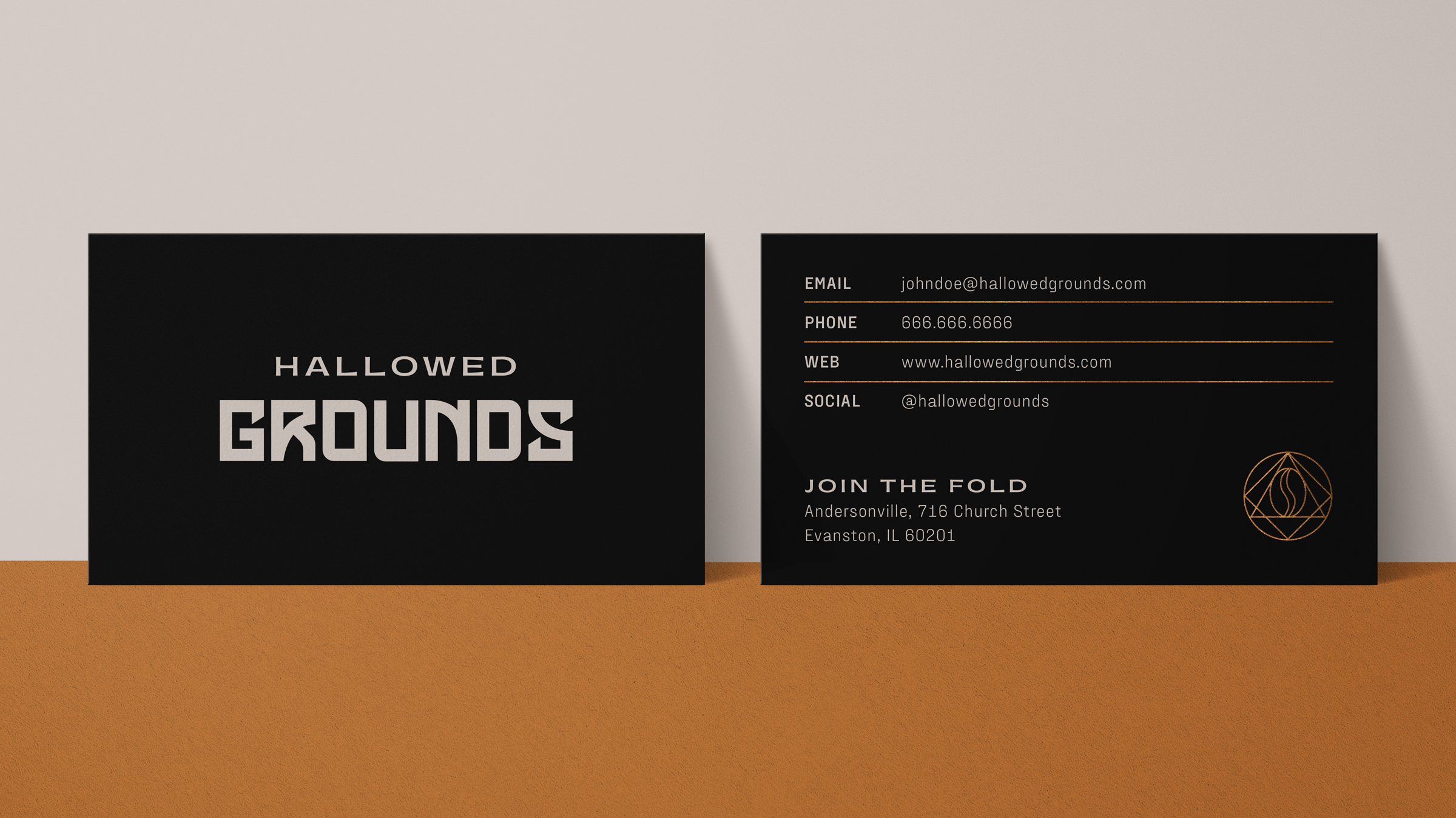
HALLOWED
GROUNDS
Packaging +Digital Design
ROLE Design Lead
YEAR 2022
Hallowed Grounds is a student-run coffee shop that has given community members space to congregate (and caffeinate) on their own terms. As one of the best-kept secrets in the University of Chicago campus, finding your way to its doorstep can feel like infiltrating a secret society. Thankfully this organization is more interested in practicing different drip-methods and coffee creamers than any blood magics or sacrifices… for now at least.
The Ask
In order to separate themselves from the other student-run shops, Hallowed Grounds was looking for a comprehensive rebrand that honored their gothic roots without being overly gratuitous. Production costs would also need to be kept in mind given their modest annual budget. The focus would be placed on the coffee bags themselves, followed by social posts and a monthly newsletter to ensure members are kept up-to-date on all things caffeinated.
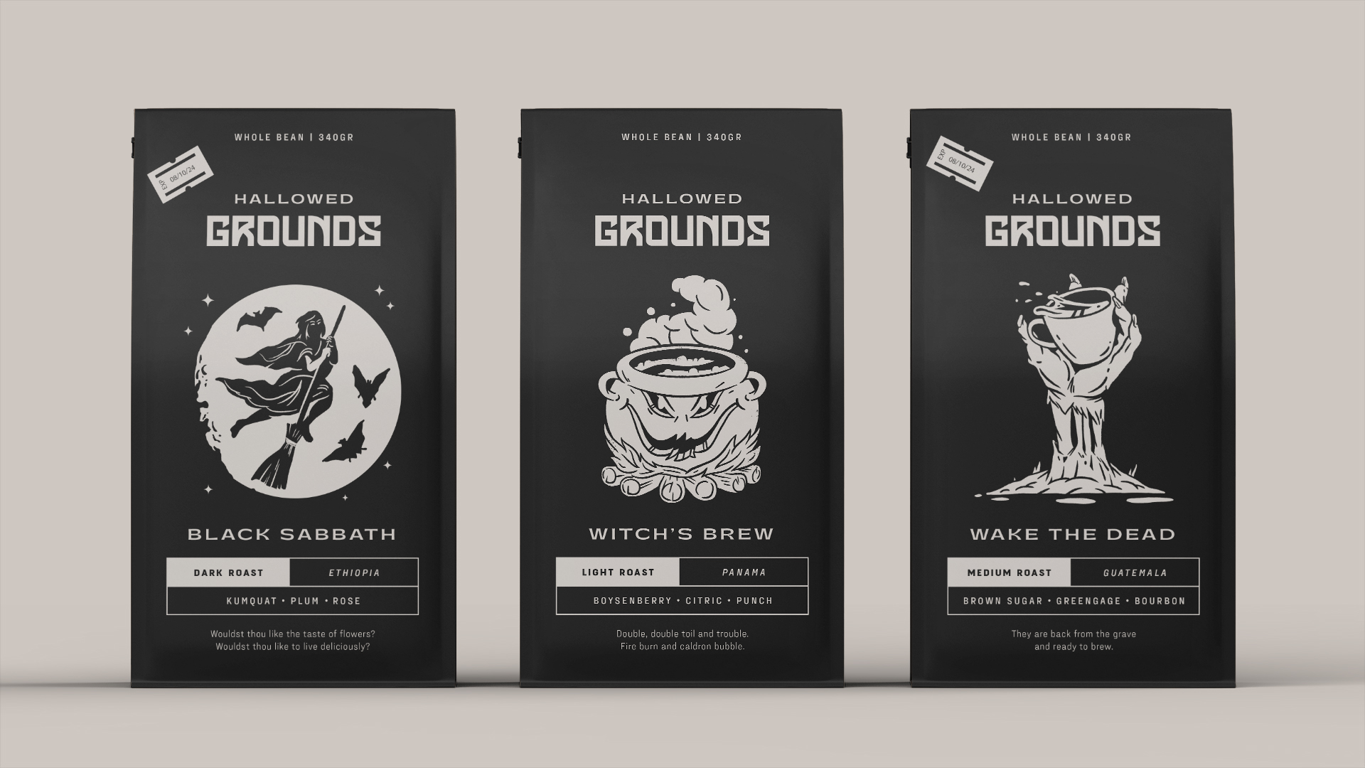
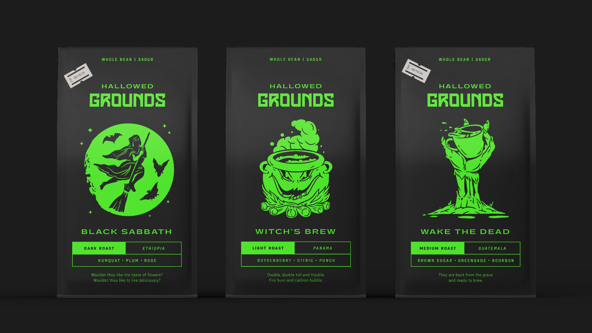
Drag the slider to view a glow-in-the-dark treatment.
BUILDING A BRAND
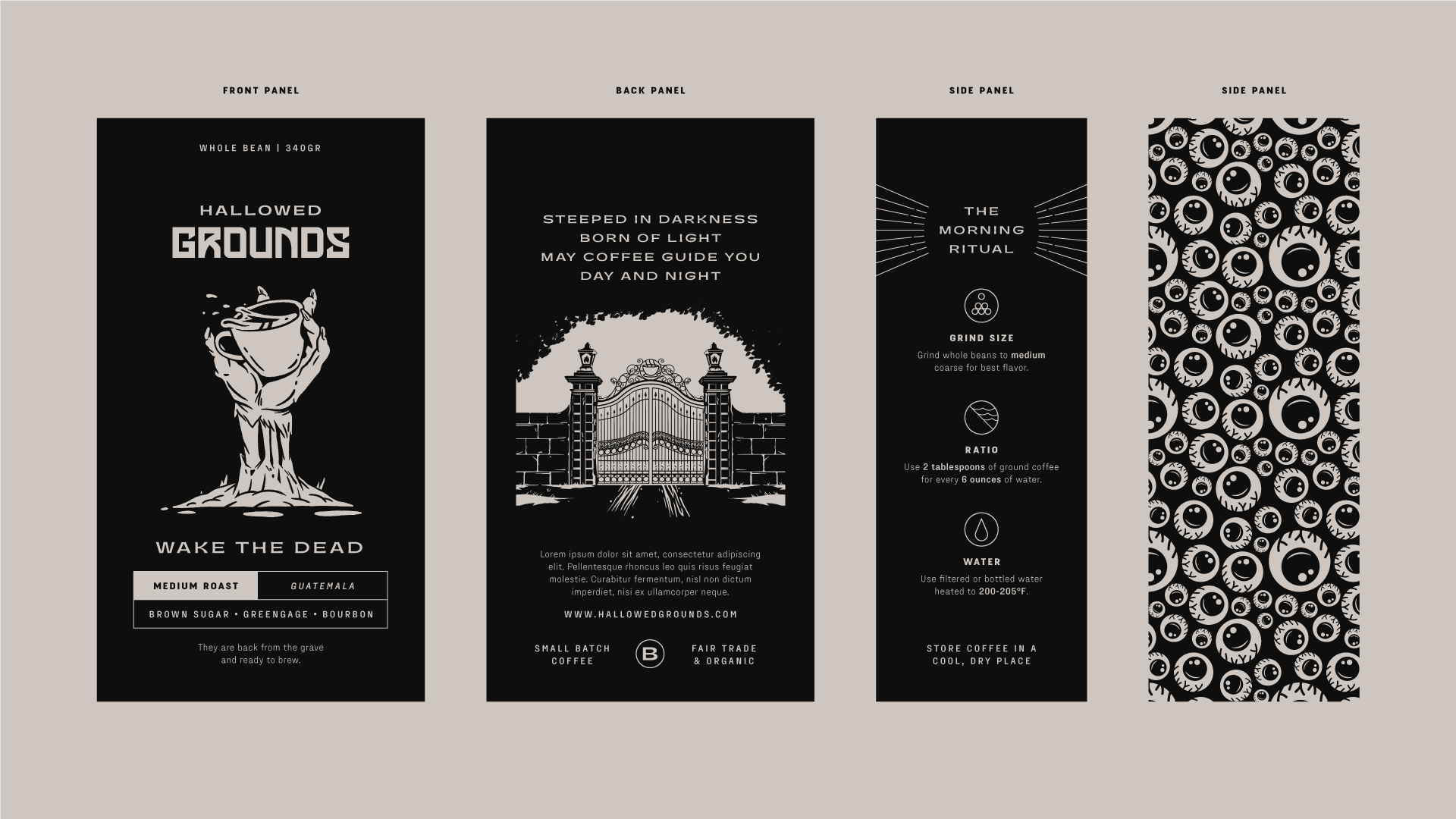
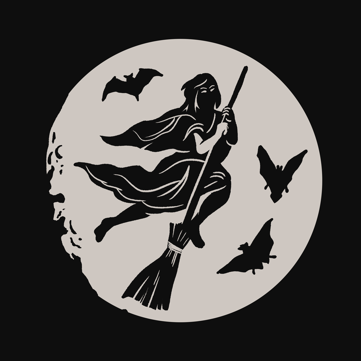
There is nothing better than a scary-good cup of coffee. With that in mind (and mug in hand) I focused on the brand name to see what imagery came to mind. It didn’t take long for stories of ghosts, zombies, and countless 80’s classics to take center stage, leading to the creepy and creative packaging featured below.
By utilizing a glow-in-the-dark ink and horror based imagery, we arrived at a brand that felt young, irreverent, and fun, all year round. The limited color palette was an asset in the end, as it kept the packaging sleek and effective without falling into Spirit Halloween levels of kitsch.
Logo and Typography
The logo and typography used needed to communicate the brands horror-based roots, even when removed from boiling cauldrons and hungry ghouls.
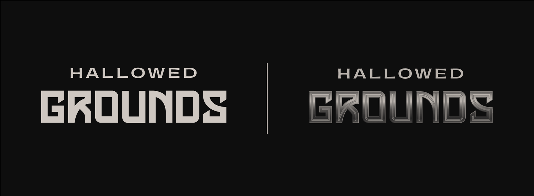
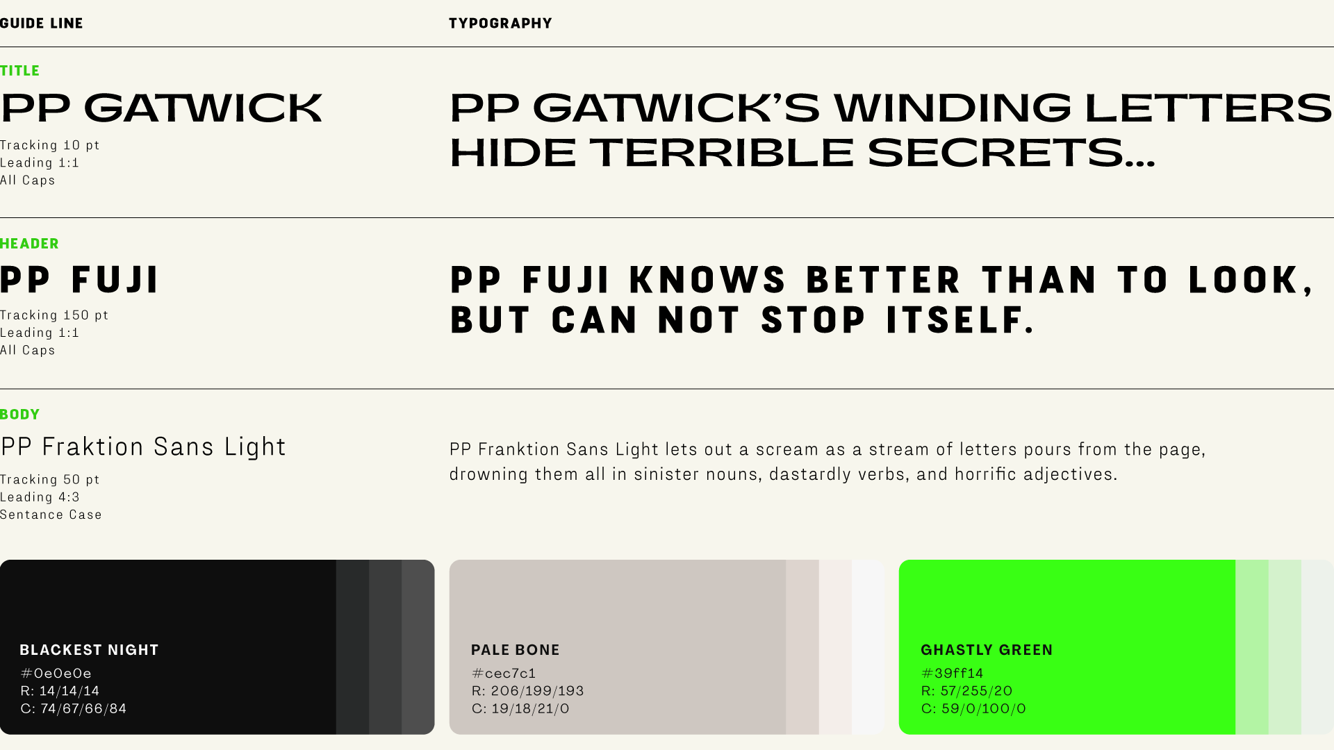
To achieve this I paired PP Gatwick (a wide and pointed san-serif font) with a customized letterset based on a collection of gravestone typography.
The final result can be rendered in two ways; a flat vector approach or a textured gradient with an in-line bevel.
A LITTLE MORE
TO CHEW ON

Hi, I’m Kane Metz, an art director and designer with 9+ years of agency experience. When I’m off the clock you can find me reading, watching movies, playing tabletop rpgs, or biking Chicago’s lakefront path.
© 2024 Kane Metz. Website constructed using WordPress and the Divi Theme builder.

